
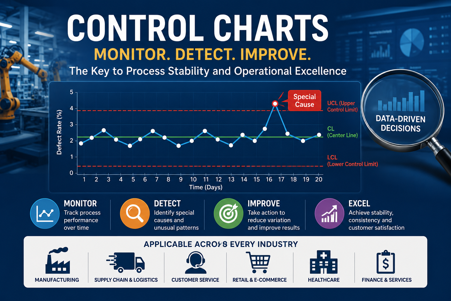
Control Charts: A Practical Guide to Statistical Process Control
In every business process, variation exists. Orders are not always delivered at the same speed. Production lines do not always produce the exact same output. Customer service response times change from day to day. Inventory accuracy fluctuates. Even well-designed processes move within a natural range.
The problem is not variation itself. The real problem is not knowing whether the variation is normal or whether it is a warning sign.
This is where control charts become one of the most powerful tools in operational excellence, quality management, Lean Six Sigma, manufacturing, supply chain, healthcare, logistics, and service operations.
A control chart helps teams answer a critical question:
Is the process stable, or has something unusual happened that requires investigation?
Instead of reacting emotionally to every increase or decrease in performance, control charts allow leaders to make decisions based on data, patterns, and statistical signals.
What Is a Control Chart?
A control chart is a statistical process control tool used to monitor process performance over time. It plots process data in sequence and compares it against a center line and control limits.
A typical control chart includes:
- Data points arranged in time order
- A center line representing the process average
- An upper control limit
- A lower control limit
- Patterns that indicate whether the process is stable or unstable
The main purpose of a control chart is not only to show performance. Its real value is to distinguish between two types of variation: common cause variation and special cause variation.
Common Cause vs. Special Cause Variation
Common Cause Variation
Common cause variation is the natural variation built into the process. It comes from the normal system of work.
Examples include:
- Normal small differences between operators
- Minor daily demand changes
- Regular machine vibration
- Normal supplier lead-time variation
- Expected customer traffic fluctuation
When a process shows only common cause variation, it is considered statistically stable. This does not mean the process is good. It only means the process is predictable.
A stable process can still be too slow, too costly, or too defective. In that case, the solution is not to blame individuals. The solution is to improve the system.
Special Cause Variation
Special cause variation happens when something unusual affects the process.
Examples include:
- Machine breakdown
- New untrained operator
- Wrong material batch
- System outage
- Supplier delay
- Missing work instruction
- Incorrect setup
- Sudden demand spike
Special cause variation means the process has been affected by a specific event or condition. This requires investigation and corrective action.
Why Control Charts Matter
Many managers review performance using daily, weekly, or monthly reports. They see a number go up or down and immediately ask, “What happened?”
Sometimes that reaction is useful. But often it leads to overreaction.
Without a control chart, a normal fluctuation may look like a serious problem. Teams may waste time explaining random variation, changing procedures unnecessarily, or blaming people for results that are actually caused by the system.
Control charts help organizations avoid three common mistakes:
- Reacting to normal variation as if it were a problem
- Ignoring real warning signals hidden inside the data
- Making process changes without evidence
A control chart turns performance management from opinion-based discussion into evidence-based decision-making.
Control Limits Are Not Specification Limits
One of the most common misunderstandings is confusing control limits with specification limits.
Control Limits
Control limits are calculated from actual process data. They show the expected range of natural process variation.
They answer the question:
What is this process currently capable of doing?
Specification Limits
Specification limits are defined by the customer, contract, regulation, engineering requirement, or business target.
They answer the question:
What does the customer or business require?
A process can be statistically stable but still fail to meet customer requirements. For example, a delivery process may consistently deliver in 5 to 7 days, but the customer requirement may be 3 days. In this case, the process is stable but not capable.
This distinction is essential. Control charts tell us whether the process is predictable. Capability analysis tells us whether the process meets requirements.
Basic Structure of a Control Chart
A control chart usually contains the following elements:
1. Time-Ordered Data
The data must be plotted in the order it happened. Control charts are not simple bar charts. Sequence matters because the goal is to detect changes over time.
2. Center Line
The center line usually represents the average process performance.
3. Upper Control Limit
The upper control limit shows the highest expected level of normal process variation.
4. Lower Control Limit
The lower control limit shows the lowest expected level of normal process variation.
5. Process Signals
Signals are patterns that suggest the process may no longer be stable. These signals help teams identify when investigation is needed.
When Should You Use a Control Chart?
Control charts are useful whenever you need to monitor a process over time.
They can be used for:
- Product defect rates
- Machine downtime
- Order fulfillment time
- Delivery lead time
- Customer complaints
- Call center waiting time
- Inventory accuracy
- Forecast accuracy
- Supplier delivery performance
- Warehouse picking errors
- Production cycle time
- Rework percentage
- Scrap rate
- Healthcare waiting time
- Invoice processing time
- On-time project completion
Any repeated process with measurable output can benefit from control chart analysis.
Main Types of Control Charts
Choosing the correct control chart depends on the type of data.
| Control Chart Type | Best Used For | Example |
|---|---|---|
| I-MR Chart | Individual continuous observations | Daily delivery lead time, monthly demand, ticket resolution time |
| X-Bar and R Chart | Continuous data collected in small subgroups | Product weight, part diameter, filling volume |
| X-Bar and S Chart | Continuous data with larger subgroups | Batch quality measurements, process capability monitoring |
| P Chart | Proportion defective with variable sample size | Percentage of late orders, percentage of failed inspections |
| NP Chart | Number defective with constant sample size | Defective units from a fixed daily inspection quantity |
| C Chart | Defect count with constant area of opportunity | Errors per report, scratches per panel |
| U Chart | Defects per unit with variable sample size | Complaints per shipment, defects per 1,000 units |
1. I-MR Chart
The Individuals and Moving Range chart is used when data is collected one observation at a time.
Use it for:
- Daily sales
- Monthly demand
- Delivery time per order
- Machine temperature readings
- Weekly customer complaints
- Lead time per shipment
This is one of the most practical charts for business, supply chain, and service operations because many organizations collect data as individual values rather than subgroup samples.
2. X-Bar and R Chart
The X-Bar and R chart is used when measurements are collected in small subgroups.
Use it for:
- Diameter of manufactured parts
- Product weight samples
- Filling volume
- Batch quality checks
- Repeated production measurements
The X-Bar chart monitors the process average. The R chart monitors the range within each subgroup.
3. X-Bar and S Chart
The X-Bar and S chart is similar to the X-Bar and R chart, but it uses standard deviation instead of range.
Use it when subgroup sizes are larger or when a more accurate estimate of variation is required.
4. P Chart
The P chart is used for the proportion of defective units.
Use it for:
- Percentage of late orders
- Percentage of defective items
- Percentage of failed inspections
- Percentage of customer complaints
- Percentage of incorrect invoices
The P chart is useful when sample sizes vary.
5. NP Chart
The NP chart is used for the number of defective units when the sample size is constant.
Example: A factory inspects 500 units daily and counts how many are defective.
6. C Chart
The C chart is used for counting defects when the area of opportunity is constant.
Use it for:
- Number of scratches per panel
- Number of defects per invoice batch
- Number of errors per report
- Number of missing labels per shipment
The key condition is that the inspection area or opportunity remains constant.
7. U Chart
The U chart is used for defects per unit when the sample size or area of opportunity changes.
Use it for:
- Defects per 1,000 units
- Errors per order line
- Complaints per shipment
- Claims per customer account
The U chart is useful when the number of units inspected changes from period to period.
How to Build a Control Chart
Building a control chart requires more than inserting data into software. The quality of the analysis depends on how the data is selected, structured, and interpreted.
Step 1: Define the Process
Start by defining the process clearly.
Examples:
- Order picking process
- Supplier delivery process
- Production filling process
- Customer complaint resolution process
- Warehouse receiving process
A vague process definition leads to weak analysis.
Step 2: Select the Metric
Choose a measurable output that matters to the business.
Good metrics include:
- Defect percentage
- Lead time
- Rework rate
- Complaint count
- Cycle time
- Downtime minutes
- Picking error rate
- On-time delivery percentage
The metric should be connected to customer value, cost, quality, delivery, safety, or productivity.
Step 3: Collect Data in Time Order
Control chart data must be collected in sequence. Do not rearrange data by highest to lowest or by category. The purpose is to understand how the process behaves over time.
Examples of time order:
- Daily
- Weekly
- Monthly
- Per batch
- Per shift
- Per production run
- Per shipment
Step 4: Choose the Correct Chart Type
The chart type depends on whether the data is continuous or attribute data.
Continuous data examples: time, weight, length, temperature, cost, speed.
Attribute data examples: defective or not defective, error count, complaint count, pass or fail, late or on time.
Using the wrong chart type can produce misleading signals.
Step 5: Calculate the Center Line and Control Limits
The center line is usually the average of the process data. The control limits are statistically calculated based on process variation.
Most basic control charts use upper and lower control limits to define the expected range of process behavior. These limits are not targets. They are decision boundaries.
Step 6: Plot and Interpret the Chart
After plotting the chart, look for signals such as:
- A point outside the control limits
- A long run of points above or below the center line
- A clear upward or downward trend
- Repeating cycles or patterns
- Sudden shifts in the process average
- Unusual clustering near the control limits
These signals suggest that the process may have changed and should be investigated.
How to Interpret Control Chart Signals
A control chart should not be treated as a decoration in a dashboard. It is a decision-making tool.
Signal 1: One Point Outside the Control Limits
This is one of the strongest signs of special cause variation.
Possible causes:
- Equipment failure
- Wrong input material
- Operator error
- System outage
- New supplier issue
- Process setup problem
Action: Investigate what happened at that exact time.
Signal 2: Several Points on One Side of the Center Line
If many consecutive points appear above or below the center line, the process may have shifted.
Possible causes:
- New method
- New team
- New policy
- Process improvement
- Supplier change
- Demand pattern change
Action: Identify what changed before the shift started.
Signal 3: Continuous Upward or Downward Trend
A trend may indicate gradual deterioration or improvement.
Possible causes:
- Tool wear
- Learning curve
- Process fatigue
- Increasing demand pressure
- Poor maintenance
- Gradual improvement from training
Action: Study the trend before it becomes a major problem.
Signal 4: Repeating Cycles
A cycle may indicate a repeated pattern linked to time, shifts, batches, suppliers, or operating conditions.
Possible causes:
- Weekend staffing difference
- Monthly closing pressure
- Supplier delivery cycle
- Seasonal demand
- Shift handover issue
Action: Compare the pattern with operational events.
Practical Example: Warehouse Picking Errors
A warehouse manager monitors daily picking error rate. The average error rate is 2%. Most days fall between 0.5% and 3.5%. One day, the error rate jumps to 4.2%.
Without a control chart, the manager may simply say, “The team performed badly today.”
With a control chart, the manager can see that the point is outside the upper control limit. This is a special cause signal.
The investigation finds that a temporary team was assigned to a high-volume zone without proper barcode scanning training. The root cause is not general poor performance. The root cause is a specific training and process-control gap.
Corrective actions may include:
- Short training before shift start
- Mandatory scanner validation
- Supervisor check during the first hour
- Clear picking-zone instructions
- Error review by SKU and picker
The control chart helps the manager avoid blame and focus on the process.
Control Charts in Manufacturing
In manufacturing, control charts are used to monitor process consistency and reduce variation.
Examples include:
- Product dimensions
- Filling weight
- Assembly defects
- Machine downtime
- Scrap rate
- Rework percentage
- Paint thickness
- Packaging defects
Manufacturing teams use control charts to detect early warning signals before defects reach the customer.
Control Charts in Supply Chain and Logistics
Control charts are highly valuable in supply chain operations because variation directly affects cost, service level, and customer satisfaction.
Examples include:
- Supplier lead time
- On-time delivery
- Warehouse picking accuracy
- Receiving cycle time
- Stock count accuracy
- Transport delay rate
- Order fulfillment time
- Return rate
A control chart can show whether delivery delays are random, seasonal, supplier-specific, or caused by a real process breakdown.
Control Charts in Retail and E-Commerce
Retail and e-commerce businesses can use control charts to monitor operational performance across online orders, fulfillment, customer service, and returns.
Examples include:
- Daily cancellation rate
- Order processing time
- Return percentage
- Customer complaint rate
- Delivery failure rate
- Out-of-stock incidents
- Forecast error
- Website order error rate
For e-commerce companies, control charts are especially useful because daily performance naturally fluctuates. The chart helps separate normal demand noise from real operational problems.
Control Charts in Service Operations
Service businesses can use control charts to improve speed, consistency, and customer experience.
Examples include:
- Call waiting time
- Ticket resolution time
- Complaint closure time
- Invoice processing time
- Approval cycle time
- First response time
- Customer satisfaction scores
In service operations, control charts help leaders avoid overreacting to a single bad day and focus on meaningful process signals.
Control Charts and Lean Six Sigma
Control charts are strongly connected to Lean Six Sigma because they support data-driven problem solving.
In the DMAIC methodology, control charts are especially useful in the Measure, Analyze, Improve, and Control phases.
Measure Phase
They help understand current process behavior.
Analyze Phase
They help detect instability and identify when special causes occurred.
Improve Phase
They help compare performance before and after improvement.
Control Phase
They help sustain gains and prevent the process from slipping back.
A project is not truly controlled just because an improvement was implemented. It is controlled when the process continues to perform predictably over time.
Control Chart vs. Run Chart
A run chart plots data over time, usually with a median or average line. It helps show trends and shifts.
A control chart goes further by adding statistically calculated control limits.
A run chart answers:
Is performance moving up or down over time?
A control chart answers:
Is this movement normal variation or a signal that the process has changed?
Both tools are useful, but control charts provide stronger decision support.
Control Chart vs. Pareto Chart
A Pareto chart ranks problems by frequency or impact. It helps identify the biggest contributors.
A control chart monitors performance over time. It helps identify process stability.
Use a Pareto chart when you want to know:
Which problem should we prioritize?
Use a control chart when you want to know:
Is the process stable or changing?
Together, they are very powerful. A Pareto chart identifies the priority problem. A control chart monitors whether the improvement is sustained.
Common Mistakes When Using Control Charts
Mistake 1: Using Too Little Data
Control charts need enough data points to understand process behavior. A chart with only a few points may not provide reliable insight.
Mistake 2: Mixing Different Processes
Do not combine data from different machines, teams, suppliers, product families, or locations unless the process is genuinely the same.
Mixing different processes can hide important signals.
Mistake 3: Treating Control Limits as Targets
Control limits are not performance goals. They are statistical boundaries.
A process may be inside control limits but still fail business targets.
Mistake 4: Reacting to Every Data Point
Not every increase or decrease requires action. Control charts help prevent unnecessary process tampering.
Mistake 5: Ignoring Special Cause Signals
When a signal appears, it should be investigated. Ignoring special causes allows problems to repeat.
Mistake 6: Using the Wrong Chart Type
Using a P chart when an I-MR chart is needed, or using a C chart when a U chart is required, can lead to incorrect conclusions.
How Control Charts Support Better Management
Control charts improve management decision-making because they create a fact-based view of process performance.
They help leaders:
- Understand process stability
- Detect unusual events early
- Avoid unnecessary reactions
- Prioritize root cause analysis
- Measure improvement impact
- Sustain operational gains
- Improve accountability without blame
- Build a continuous improvement culture
A control chart changes the conversation from “Who caused the problem?” to “What does the process data tell us?”
Control Charts and Root Cause Analysis
Control charts are not root cause analysis tools by themselves. They tell you when to investigate.
Once a signal appears, the team can use other tools to identify the cause, such as:
- 5 Whys
- Fishbone diagram
- Pareto analysis
- Process mapping
- Gemba walk
- Failure Mode and Effects Analysis
- Data stratification
The control chart detects the signal. Root cause analysis explains the signal.
Practical Implementation Checklist
To implement control charts effectively, follow this checklist:
- Define the process clearly
- Select a meaningful metric
- Confirm the data source
- Collect data in time order
- Choose the correct control chart type
- Calculate the center line and control limits
- Review the chart for signals
- Investigate special causes
- Avoid reacting to normal variation
- Link findings to corrective actions
- Monitor the process after improvement
- Review charts regularly in management meetings
Mini Case Study: Reducing Customer Complaints
A service company was receiving customer complaints about delayed order confirmations. Management reviewed the weekly complaint count and noticed that complaints sometimes increased sharply.
At first, the team believed employees were not working consistently. However, after building a control chart, the company discovered that most weekly changes were normal variation. Only two weeks showed special cause signals.
Further investigation showed that both weeks had the same issue: a system integration delay between the website and the order management system after a software update.
The company corrected the integration issue, added a daily system check, and created an alert when confirmation messages were delayed.
The result was not only fewer complaints but also better management discipline. The company stopped blaming weekly performance fluctuations and started responding only to real process signals.
Best Practices for Control Charts
To get the best value from control charts:
- Use reliable data
- Keep the process definition consistent
- Review charts regularly
- Train teams on common and special cause variation
- Investigate signals quickly
- Do not adjust the process without evidence
- Combine control charts with root cause analysis
- Use control charts after improvement projects
- Separate data by machine, team, supplier, location, or product family when needed
Control charts are most powerful when they become part of daily and weekly management routines.
Frequently Asked Questions About Control Charts
What is the main purpose of a control chart?
The main purpose of a control chart is to monitor process performance over time and identify whether variation is normal or caused by a special event.
Are control charts only used in manufacturing?
No. Control charts can be used in manufacturing, logistics, healthcare, retail, e-commerce, finance, customer service, project management, and many other business processes.
What is the difference between control limits and specification limits?
Control limits come from actual process data and show expected process variation. Specification limits come from customer, business, regulatory, or engineering requirements.
Can a process be stable but still bad?
Yes. A process can be statistically stable but still fail to meet customer expectations. Stability means predictability, not necessarily good performance.
How many data points are needed for a control chart?
A practical starting point is usually around 20 to 25 data points, but the exact requirement depends on the chart type, process behavior, and business context.
What should we do when a point is outside the control limits?
Investigate the specific time period, identify what changed, confirm the root cause, and take corrective action if needed.
Should we change the process whenever performance gets worse?
Not always. If the change is within normal process variation, adjusting the process may create more instability. Control charts help decide when action is justified.
Which control chart should I use?
The correct chart depends on the data type. Continuous data may require an I-MR, X-Bar R, or X-Bar S chart. Attribute data may require a P, NP, C, or U chart.
Conclusion
Control charts are one of the most important tools in statistical process control and operational excellence. They help organizations understand variation, detect real process changes, avoid unnecessary reactions, and sustain improvement.
A control chart does not simply show whether performance is good or bad. It shows whether the process is stable, predictable, and under control.
For leaders, this is a major advantage. Instead of managing by opinion, pressure, or isolated numbers, control charts enable better decisions based on process behavior.
Organizations that use control charts effectively can reduce defects, improve delivery performance, control costs, strengthen customer satisfaction, and build a culture of continuous improvement.
Need Help Building Control Charts for Your Business?
At OpexEdge, we help businesses turn operational data into practical improvement actions. Whether you are facing quality issues, delivery delays, warehouse errors, customer complaints, or unstable process performance, our team can help you build the right control charts, identify root causes, and implement sustainable improvements.
Need help improving process stability and reducing variation?
Contact OpexEdge today to start your operational excellence journey.
Website: https://opexedg.com
Email: info@opexedg.com
References
Related TopicsTPM, Hypothesis Test , Accuracy, 6Sigma, MSA, POKAYOKE, MUDA, 5S, FMEA, SIPOC, KPI, ISO9001, ISO20022, w/h, demand planning , OTB , KANO, case study, OTB service, demand planning service , SC service, problem solving service ,
