
User Experience Interface Design: Turning Digital Interfaces into Business Performance
Author: Mahmoud Elhefnawi – OpexEdge Expert
Introduction
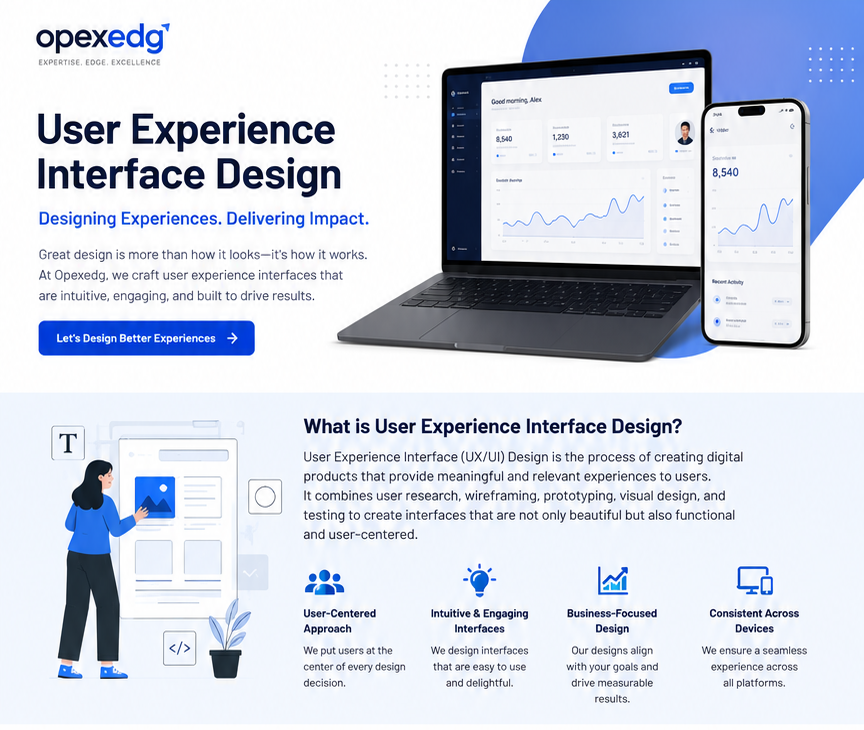
User Experience Interface Design is no longer only about creating attractive screens. It is about designing digital experiences that help users complete tasks faster, understand information clearly, make decisions confidently, and interact with a product without confusion.
In today’s business environment, websites, dashboards, mobile applications, portals, ERP systems, e-commerce platforms, and customer-service tools all depend on one critical factor: how easily users can use them.
According to Nielsen Norman Group, user experience includes all aspects of the user’s interaction with a company, its services, and its products. ISO 9241-210 also emphasizes human-centered design by focusing on users, their needs, requirements, usability, and human factors.
At OpexEdge Consultancy, UX/UI design is treated as a business improvement tool, not only a design activity. A well-designed interface can reduce errors, improve productivity, increase conversion, reduce support requests, and strengthen customer trust.
What Is User Experience Interface Design?
User Experience Interface Design combines two connected disciplines:
User Experience Design – UX focuses on how users feel, think, and behave when interacting with a product, system, or service.
User Interface Design – UI focuses on the visual and interactive elements users see and use, such as buttons, menus, forms, dashboards, icons, colors, layout, spacing, and navigation.
A strong UX/UI design answers practical question:
Can users understand what to do next?
Can they complete their task without unnecessary steps?
Can they find important information quickly?
Does the interface reduce mistakes?
Does the design support the business goal?
Does the experience build trust?
Good design is not decoration. Good design removes friction.
Why UX/UI Design Matters for Business
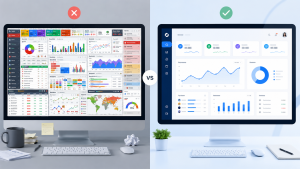
Many companies lose customers, sales, time, and productivity because their digital interfaces are difficult to use. The problem may not be the product itself. The problem may be the experience around the product.
A weak interface can create:
High bounce rate on websites.
Low conversion rate.
Abandoned carts.
Repeated customer-service questions.
Data-entry errors.
Slow employee performance.
Poor adoption of internal systems.
Low trust in the brand.
A strong UX/UI interface can help businesses:
Improve customer satisfaction.
Increase website and app conversion.
Reduce training time.
Improve employee productivity.
Reduce operational errors.
Improve digital service adoption.
Support data-driven decision-making.
Increase customer retention.
Nielsen Norman Group defines usability through key quality components such as learnability, efficiency, memorability, errors, and satisfaction. These components are directly connected to business performance because every unnecessary click, unclear message, or confusing form can create cost.
The Core Principles of Effective UX/UI Design
1. Start with the User
Every interface should begin with understanding the real user. Who are they? What are they trying to achieve? What problems do they face? What information do they need? What devices do they use?
Designing without user understanding often leads to attractive screens that fail in real use.
2. Make the Process Simple
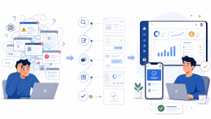
A good interface simplifies the user journey. It removes unnecessary steps, reduces decision overload, and helps users move from start to finish with confidence.
For example, a service-request form should not ask for unnecessary information before the user understands the value. An e-commerce checkout should not create confusion at the payment stage. A dashboard should not hide the most important KPIs under too many menus.
3. Design Clear Visual Hierarchy
Users do not read every element on a screen equally. They scan. Good UI design guides attention using size, spacing, contrast, alignment, and grouping.
The most important information should be easy to notice. The next action should be obvious. The screen should help the user decide what matters first.
4. Build Consistency
Consistency helps users feel familiar with the interface. Buttons, icons, colors, labels, form fields, alerts, and navigation patterns should behave predictably.
Inconsistent design increases cognitive effort. Consistent design reduces learning time and improves confidence.
5. Test with Real Users
UX/UI design should not depend only on opinions. It should be validated through testing, observation, analytics, feedback, and continuous improvement.
User testing can reveal where people hesitate, where they misunderstand instructions, where they abandon the process, and where the design creates unnecessary friction.
UX/UI Design and Operational Excellence
UX/UI design has a strong relationship with operational excellence.
Operational Excellence focuses on delivering customer value with minimum waste, clear processes, measurable performance, and continuous improvement. OpexEdge positions its work around helping businesses identify gaps, reduce risk, and build practical improvement roadmaps.
A poor interface creates digital waste.
Examples of digital waste include:
Repeated data entry.
Unclear approval steps.
Searching for information.
Wrong form submissions.
Manual corrections.
Customer follow-up calls.
Low adoption of digital tools.
Unnecessary training.
When UX/UI design is integrated with process improvement, the business can improve both the customer experience and the internal operating model.
Case Study: Redesigning a B2B Service Request Interface
Business Situation
A B2B service company had a website form for receiving client inquiries. The company was receiving traffic, but the conversion rate was low. Many visitors opened the service page but did not complete the request form.
The management team believed the issue was marketing. After reviewing the user journey, the real problem was the interface experience.
Key Problems Found
The service description was too long before the CTA.
The request form asked too many questions too early.
The CTA button was not visually clear.
The mobile experience was difficult to use.
There was no trust signal near the form.
The page did not explain what happens after submission.
The user had no reason to feel confident.
Improvement Actions
The page was redesigned around a clearer user journey:
A strong headline explaining the business value.
A short problem statement.
Clear service benefits.
Visual process steps.
Shorter inquiry form.
Visible contact details.
CTA repeated after key sections.
Trust signals added near the form.
Mobile layout simplified.
Expected Business Impact
After UX/UI improvement, the company can expect:
Higher inquiry conversion rate.
Lower visitor confusion.
Better quality of submitted leads.
Reduced back-and-forth communication.
Improved mobile experience.
Stronger trust in the service.
Faster customer decision-making.
Lesson Learned
The problem was not only traffic. The problem was experience.
A business can invest in ads, SEO, and content, but if the interface is confusing, users may leave before taking action. UX/UI design turns attention into action.
UX/UI Design Checklist for Business Websites and Digital Platforms
Use this checklist to review your website, app, dashboard, or portal:
Is the main value proposition clear within the first few seconds?
Is the navigation simple and predictable?
Are CTAs visible and repeated in the right places?
Are forms short, clear, and easy to complete?
Is the mobile experience smooth?
Are errors explained in simple language?
Are important actions visually prioritized?
Are users told what will happen next?
Are trust signals visible?
Is the design consistent across pages?
Are dashboards focused on decisions, not only data?
Are pages fast, readable, and easy to scan?
Are users able to complete their task without help?
Common UX/UI Mistakes Companies Should Avoid
Many companies invest in digital tools but fail to design the experience properly. Common mistakes include:
Designing based on management preference instead of user behavior.
Adding too many features on one screen.
Using unclear button labels.
Making forms too long.
Ignoring mobile users.
Using weak contrast and poor readability.
Hiding important information.
Not testing the interface before launch.
Treating UX/UI as a one-time design task.
Copying competitors without understanding users.
A strong interface should be useful, usable, clear, accessible, and aligned with business goals.
How OpexEdge Can Help
OpexEdge Consultancy can support businesses in improving digital experiences through a practical UX/UI and process-improvement approach.
Potential support can include:
UX/UI audit for websites, apps, dashboards, and portals.
Customer journey review.
Interface improvement recommendations.
Service-page conversion improvement.
Form and CTA optimization.
Dashboard usability review.
Digital process simplification.
User flow mapping.
Wireframe recommendations.
UX improvement roadmap.
AI-assisted analysis of user pain points and business gaps.
This approach connects design improvement with measurable business outcomes such as conversion, productivity, service quality, and operational efficiency.
OpexEdge also provides practical consulting services in supply chain assessment, demand planning, Open-to-Buy planning, warehouse assessment, ISO 9001 documentation, and structured problem solving.
Conclusion
User Experience Interface Design is not only a design topic. It is a business performance topic.
A well-designed interface helps customers understand faster, act with confidence, complete tasks easily, and trust the company more. It also helps internal teams reduce errors, improve productivity, and manage digital processes more effectively.
For companies investing in websites, dashboards, mobile apps, customer portals, ERP systems, or service platforms, UX/UI design should be treated as a strategic improvement area.
The best interface is not the one with the most features. It is the one that helps the right user complete the right task with the least friction and the highest confidence.
Ready to improve your website, platform, dashboard, or customer journey?
Contact OpexEdge Consultancy to request a UX/UI review and discover how better interface design can improve conversion, productivity, and customer experience.
Email: info@opexedg.com
Email: hefnawi@opexedg.com
Mobile / WhatsApp: +20 155 272 5900
Website: https://opexedg.com
Expert Profile: https://opexedg.com/experts/mahmoud-elhefnawi/
OpexEdge contact information is also listed on the website contact page.
Related TopicsTPM, Hypothesis Test , Accuracy, 6Sigma, MSA, POKAYOKE, MUDA, 5S, FMEA, SIPOC, KPI, ISO9001, ISO20022, w/h, demand planning , OTB , KANO, case study, OTB service, demand planning service , SC service, problem solving service ,
